
Electoral College 2016 Including States Where the Candidates are Statistically Tied
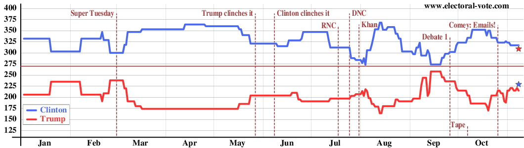
The graph above shows the electoral vote score for every day, counting, say, 46% to 45% as a win for the candidate with 46%, even though this is really a statistical tie. The gray vertical lines show the boundaries between the months.
Electoral College 2016 Excluding States Where the Candidates are Statistically Tied
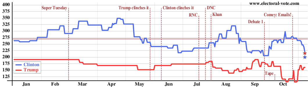
The graph above shows the electoral votes again but omits the "barely" states. The electoral votes of a state only count in this graph if the candidate is ahead by more than the margin of error (about 5%). In other words, the states with white centers on the map, which are statistical ties, are omitted in the above graph. Clinton's decline in May is an artifact. Early in the year, before a state was polled in 2016, the 2012 election results were used. As 2016 Clinton-Trump state polls started coming in, the 2016 data began to replace the 2012 data and the initial 2016 data were closer than the 2012 results.
Electoral College 2012 Including States Where the Candidates are Statistically Tied
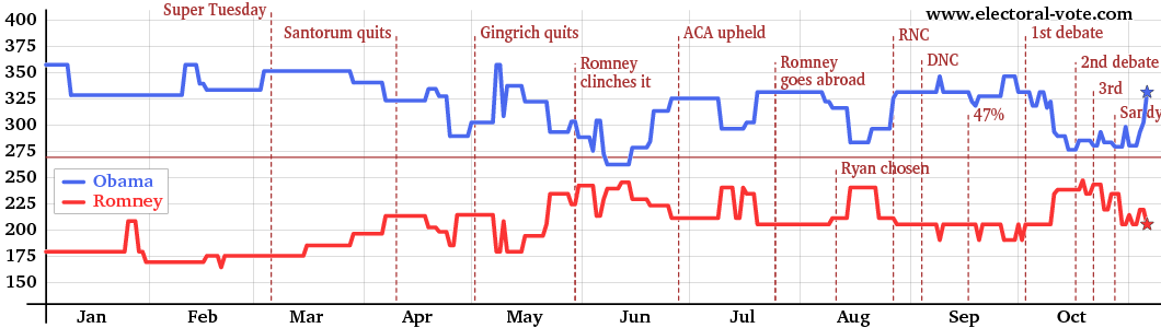
The graph above shows the electoral vote score for every day, counting, say, 46% to 45% as a win for the candidate with 46%, even though this is really a statistical tie. The gray vertical lines show the boundaries between the months.
Electoral College 2012 Excluding States Where the Candidates are Statistically Tied
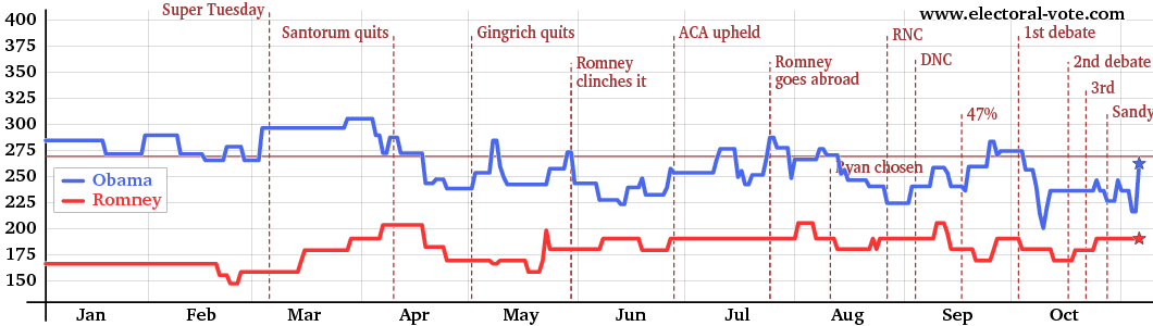
The graph above shows the electoral votes again but omits the "barely" states. The electoral votes of a state only count in this graph if the candidate is ahead by more than the margin of error (about 5%). In other words, the states with white centers on the map, which are statistical ties, are omitted in the above graph.
Electoral College 2008 Including States Where the Candidates are Statistically Tied
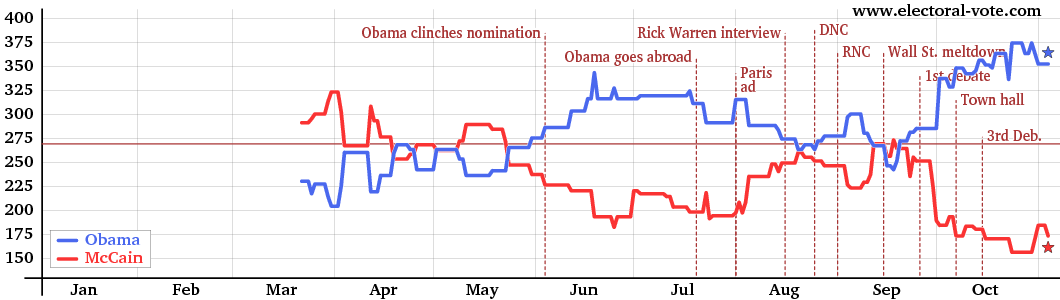
The graph above shows the electoral vote score for every day, counting, say, 46% to 45% as a win for the candidate with 46%, even though this is really a statistical tie. The gray vertical lines show the boundaries between the months.
Electoral College 2008 Excluding States Where the Candidates are Statistically Tied
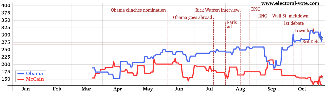
The graph above shows the electoral votes again but omits the "barely" states. The electoral votes of a state only count in this graph if the candidate is ahead by more than the margin of error (about 5%). In other words, the states with white centers on the map, which are statistical ties, are omitted in the above graph.
Electoral College 2004 Including States Where the Candidates are Statistically Tied
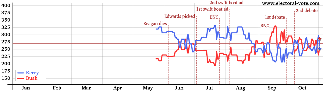
The graph above shows the electoral vote score for every day, counting, say, 46% to 45% as a win for the candidate with 46%, even though this is really a statistical tie. The gray vertical lines show the boundaries between the months.
Electoral College 2004 Excluding States Where the Candidates are Statistically Tied
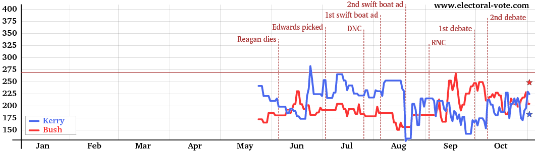
The graph above shows the electoral votes again but omits the "barely" states. The electoral votes of a state only count in this graph if the candidate is ahead by more than the margin of error (about 5%). In other words, the states with white centers on the map, which are statistical ties, are omitted in the above graph.